
Media Contact: Rashena Flagg, 713.301.4577
Research shows petrochemical plants within close proximity to schools negatively impact a child’s performance. On April 25, CHILDREN AT RISK released a new report analyzing the proximity of petrochemical plants to schools and the negative effects on children. The report sheds light on new data that examines the location of petrochemical plants and the proximity to schools. School Rankings data was used to identify the impact on overall school performance. Communities in Corpus Christi, Houston, and San Antonio fared the worse
Key Take-Aways
There are 1,718 Petro-Proximate schools in Texas, meaning they are located within 5 miles of a petrochemical plant.
Corpus Christi, Houston, and San Antonio have the highest number of petrochemical plants.
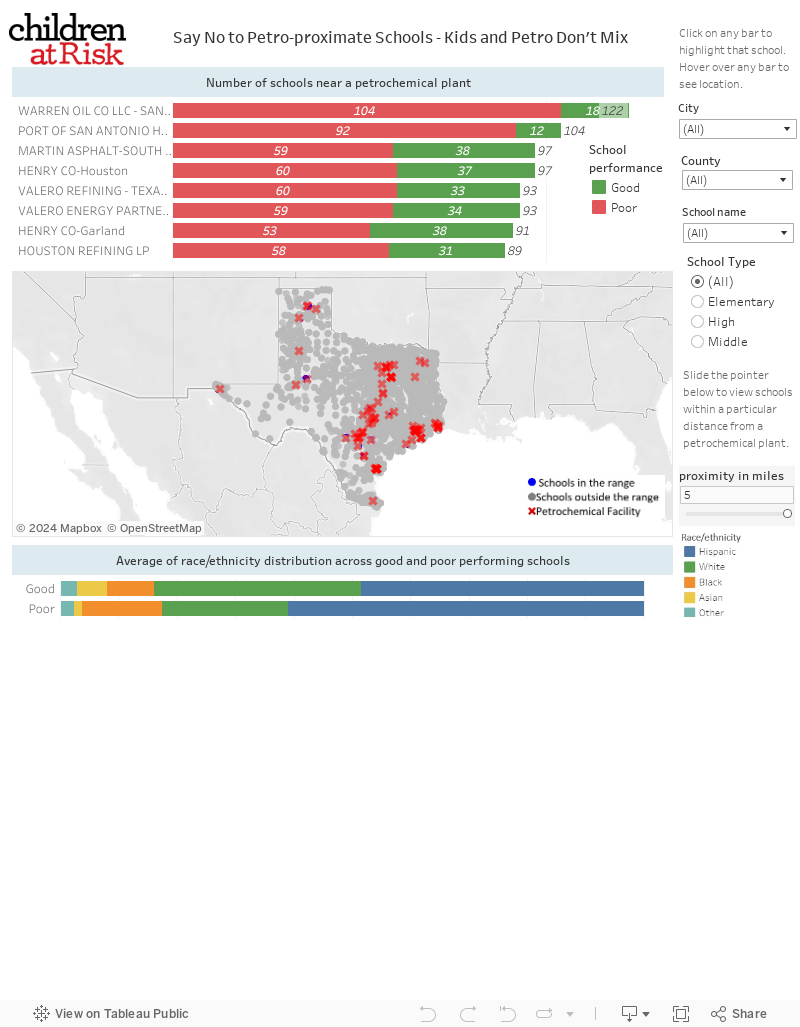
A petrochemical plant in San Antonio has 122 schools less than 5 miles away.
There were ten schools in Harris County with ten petrochemical facilities nearby.
Research shows children living near petrochemical plants are at a higher risk for asthma, ADHD, headaches, nosebleeds, hypothyroidism, short-term memory dysfunction, liver disease, and several types of cancer.
Petro-Proximate Schools in Texas
Use the map below to explore the petro-proximity of schools in your neighborhood. To use this Tableau tool in your browser, click here.
How to use the map
The map defaults to petrochemical sites in descending order for whole state. This map allows you to click on the bar to highlight the school, and hover over any bar to see locations. You can filter by City or County to see the plant name and the number of schools with red bar indicating schools that ranked C and below in the 2018-19 CHILDREN AT RISK School Rankings, and the green bar indicating the schools that were ranked A and B. Below you will see the map with school in blue dot and facility in red x. You can hover over either to see the name and other information. You can also filter by School (on the right) to find the school location and facilities nearby on the map. You can filter by school level (All, Elementary, Middle and High) as well. You can also slide the pointer to change distance to see schools within a 1-5 mile range.
At the bottom of the map, you are able to see the race/ethnicity information for students. If the map becomes too large or small, click on the home button within the map tools (which appear in the top left corner of the map when you hover under the map title).

Developed by C@R Intern Malak Awad, MS, MPH(c) under supervision of Sharmily Roy, Director, Center for Social Measurement and Evaluation. Special thank you to Iko Tumangan for sharing technical expertise with visualization.
This map was last updated on April 25, 2022. For questions or concerns, reach out to Sharmily Roy at sroy@childrenatrisk.org.